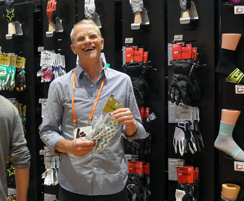
It struck me that there seemed to be at least as much focus on clothing and accessories at Interbike this year than on bicycles and components. Not that I am against cycling clothing. I support the idea of looking nice and being comfortable on the bike. That said, I felt that for all of its variety, most of the clothing exhibited was deeply unsatisfactory. Put simply: too much embellishment, not enough substance. While I obviously appreciate aesthetics, I wish there had been a greater focus on construction, fabrics and other meaningful aspects of garment and footwear design. Still I'd like to mention some tidbits from the show that I found noteworthy, interesting, or funny.
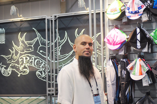
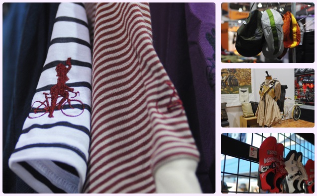
There were lots of manufacturers exhibiting cycling caps, but not all caps are created equal.While some consider the cycling cap to be a novelty item, for me it performs the very real function of soaking up sweat and keeping the sun off my forehead (applying sunscreen directly to the forehead makes it leak into my eyes). And a good fit is key, so that the cap does not shift under a road helmet. For me that means 4-panel construction, which not many manufacturers seem to offer. Happily, one of the first booths I happened to walk by was that of Pace Sportswear - the makers of my favourite cycling cap (white cotton, 4 panels, rainbow stripes, perfect!). Lots of bike shops carry Pace caps. They are simple, classic, inexpensive, and happen to fit my large head just right. What I didn't know was that the caps - all Pace clothing in fact - are made inhouse, in California. I also did not know about their background. The Colombian-born founder and cyclist, Jorge Saavedra, began making custom caps for Campagnolo in 1978. Does this make them one of the oldest cycling cap makers still in business, I wonder? In any case, it was great to meet the manufacturers of one of my favourite pieces of cycling clothing.
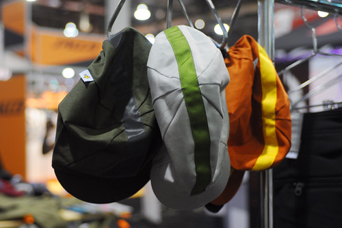
Swrve had another flattering 4-panel design on display in a variety of muted colours and with the interesting addition of reflective ribbon. These too are California made, at prices that won't break the bank.

I was intrigued by the experimental fabrics at Swrve: tissue-thin summer weight wools, as well as silk and linen blends. In my experience, it is fairly difficult to come up with a truly summer-weight wool blend for a hat, but this feather-light fabric felt promising.
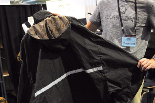
Moving downward, one trend I am noticing as far as cycling clothing for commuting, is a growing mania for capes and cloaks (see Iva Jean, Cleverhood). The waxed cotton cape from Carradice is classic and beautiful, though on the heavy side. While I appreciate the capes aesthetically and envy those who wear them gracefully on and off the bike, frankly I am terrified by their expanse of fabric and never fail to get tangled in the ones I try. I would love to see more normal, lightweight, breathable raincoats adapted for cycling.
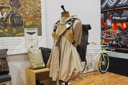
The dramatic, paratrooper-esque cloaks in the Brooks booth were certainly show stoppers, and I've just learned that their new Cambridge Cape retails at $160. Other outerwear pieces are pricier. Generally speaking, I must say there has been some behind-the-scenes backlash against expensive outerwear. I appreciate the work that must go into the high-cost products, and I appreciate them being out there as conceptual/ inspirational pieces. But there need to be more options on offer that are a step below the
haute couture price range that much of the classic cycling rainwear seems to fetch.

Swerving back to Swrve on the theme of trousers, they were the only manufacturer I saw displaying cycling pants with a proper crotch gusset. I might have to try a pair of these soon, as well as their cordura-blend jeans. As far as clothing for transportational cycling, Swrve definitely impressed me the most overall with their combination of fabric innovation, technical features (tailored, vented jackets) and "this looks like normal clothes" aesthetics.
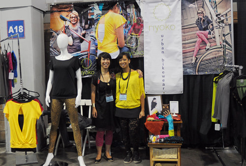
Examplified by the Riyoko booth was the trend for colourful, "spunky" bike fashion. I notice that ideas of women's urban bike wear tend to involve leggings and arm warmers. And I get it: Leggings are stretchy; arm warmers add versatility to a short-sleeved outfit. But it's a very young look and few grown women can wear this to work unless they are in the creative or fitness industries, or maybe IT. Still, I like their lace leggings and tailored jacket.
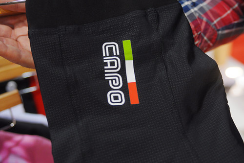
And as far as women's roadie clothing, the brand that stood out for me was Capo. The new women's line looks nice enough (black, white, navy, or Giro-pink with subtle colour accents), but what got my attention were the technical features. For starters, Capo is one of the best at preventing "sausaging" effects at the waist and thighs by using wide elastic bands. Further, there is no polyester in the tops or shorts, only nylon/spandex blends - which means those sensitive to polyester but not lycra (more common that the other way around) can wear them against the skin. But my curiosity was really peaked by the description of the abrasion-resistant weaves used in the new line. I have a baffling talent for destroying my cycling clothing, especially shorts, by snagging it against everything in sight. So something like this - if it really works of course - would be pretty useful.

Also - and probably this is just the contrarian in me, as I've never been a fan of pink - I found myself drawn to this pink cycling jersey. The colour has now gone so dramatically out of favour with women's cycling clothes manufacturers, that no one wants to touch it. Yet Capo takes a stab at it - and manages to make the pink look aggressive rather than girly. But colour aside (it is also available in black and white in fact), the jersey is interesting in that it is made of a complex mesh that feels like all holes when you have it on, yet does not look transparent. I am curious how it would feel in comparison to the lightweight wools I now wear.
Also represented was the trend for what I would call hybrid road/urban wear - roadcycling clothing that is made to kind of, sort of pass for European street clothes. Some of the merino and striped jerseys from Cafe du Cycliste looked rather nice, but my concern is that the urban touches will diminish the garments' preliminary function as roadcycling clothing while still not truly passing for "normal clothes" off the bike. While I haven't tried anything from Cafe du Cycliste specifically, I have some samples from VeloBici and Vulpine that I will review in that context soon.
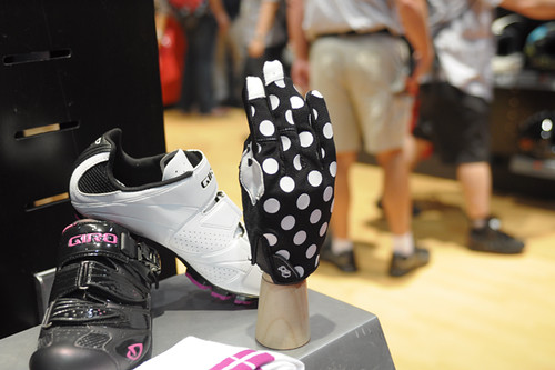
As far as cycling gloves, the trend I saw - at least for women - was for a greater selection of lightweight full-finger gloves, such as these from Giro's new women's line. I like the idea, because the tips of my fingers always manage to get burned or scraped somehow when I am on the bike for long, but in the past my hands have always gotten too hot in full-finger gloves. I'll try some and see if they do any better than the ones I tried 3 years ago.
And if you are wondering about the polka dots, this was actually a huge aesthetic theme at Interbike. Also, stripes. And the colour purple. It's as if manufacturers all brainstormed and came up with the exact same answer to the question of "How to replace pinks and florals in women's clothing?" But I tease. To be honest I actually like the stripes and polka dots. As far as the purple, it depends on the shade.

One clothing trend that was impossible to miss was the colourful explosion of cycling socks. It seems like every sock manufacturer suddenly decided to introduce a cycling-specific design, and at the same time every cycling-related company decided to add socks to their line of accessories. Everywhere I looked, I was greeted by socks and more socks, stunning in their variety of fabrics, textures, thicknesses and colours. Cycling sock lovers rejoice, for these days we are truly spoiled for choice.
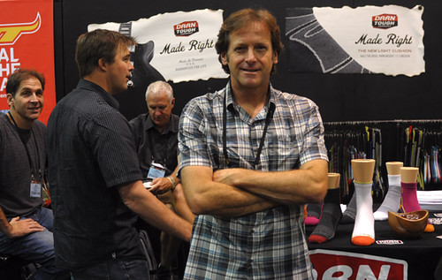
As far as wool cycling socks, the manufacturer that truly wowed was Darn Tough - made in Vermont, USA. That was just a small swatch of their sock display in the previous picture; their new line of lightweight cycling socks is impressive.
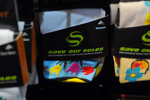
More aggressive in its styling, Save Our Soles presented a floor-to-ceiling display of cycling socks in every wild pattern imaginable. This company is like the Hallmark card of athletic socks.

They also displayed these wine bottle guards. You know, for those times when you're carrying a wine bottle home from a club ride in your bottle cage.

Promotional socks were popular as well, including these new wool-blend ones from Velo Orange.
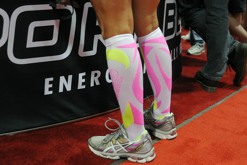
One trend that I hope someone could explain to me, is the compression socks. People were wearing them, in all sorts of crazy colours.
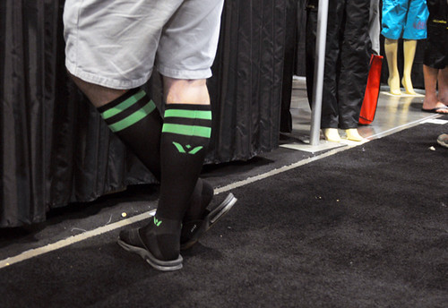
With otherwise normal outfits. While walking around the floor of Interbike. Thoughts? Seriously, I am not making fun - I just want to understand!

As far as cycling shoes, everyone was talking about the new Fizik line, with its streamlined looks and feather-weight construction. With my romance with clipless pedals in full swing, I am open to being swept up by some fantastic new shoe. But the thing is, my Mavic Cyclo Tours weigh 360 grams, cost $100, feel great, and are in great shape after nearly 6 months of wear - including getting soaked in the rain and caked in mud several times. That pretty much keeps my eye from wandering.
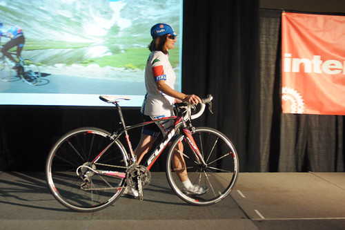
While I've probably confused and frustrated some of you by mixing up commuter and roadie attire, I was impressed to see that Interbike kept them separate. While last year there was one fashion show (here is my coverage of it), two separate shows were held at this year's event: one for "city fashions" (commuting) and the other for "technical fashions" (road and mountain biking). I stopped by the latter, and it wasn't bad: The announcer named the manufacturers, and the models' backgrounds were nicely tied into the narratives (I think all were racers or endurance riders). I think that having separate shows for these categories was a very logical solution.

It was also neat to see the designer Sheila Moon modeling her own clothes.
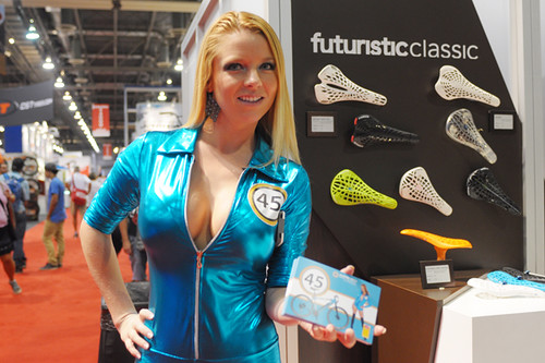
Of course a discussion of clothing at Interbike would not be complete without acknowledging the Vegas Glamour Girls hired to promote some of the products. They were very friendly, very nice to me, posing for pictures and doing their job. Reactions to these ladies (from both genders) were mixed - some were drawn to them, others embarrassed to go near them. The outfits ran the gamut from string bikinis to shiny rubbery rompers. Oh and compression socks with heels! Well, that's Interbike and Las Vegas for you.


 As we were driving home, Nora was telling us the states she has been to and what she remembered there. She told us she liked Pennsylvania and that there is a chocolate factory there. It is mind blowing to me that a four year old would be able to know the difference between the states and what she saw there. She is one smart cookie and it is neat proof of how much they do absorb from traveling like we do.
  Just a great day of fun with friends! Living the life in sunny but still cool Florida!


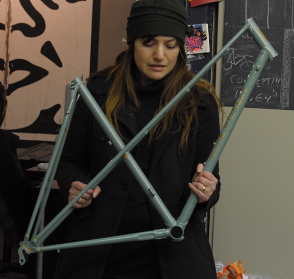 This image is not representative either, but in person the frame colour is a mesmerising blend of gray, green and slate blue. It is more green than blue, and it is more gray than either. Not a flat boring gray, but a "stormy seas" sort of gray, with infinite depth of colour to it.
 Looking at this snapshot of the beach in South Boston, I realise that the frame colour and the lug outlining are similar to the colours of the sea and sand in New England - which is probably what attracted me to the early
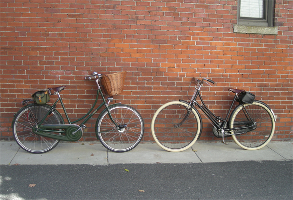 When I first posted about buying my vintage Raleigh Lady's Tourist, a reader commented that it looks like "the Pashley's grandma" and I replied that they were indeed pretty similar. But after riding the vintage Raleigh around on a daily basis for the past week, I no longer think so. Sure, the overt similarities are there: the loop frame, the upright sitting position, the enclosed chaincase and the general aura of lady-like stateliness. But the ride quality is so very different, that I was compelled to conduct a more thorough comparison.
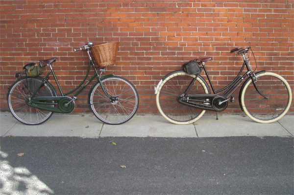 Those of you who "know bikes" can probably see straightaway that there are significant differences in proportions and angles. The vintage Raleigh's seat tube is considerably more slack (leaned back) than the Pashley's. In the photo above, this difference is undermined by the fact that I've shoved the Pashley's saddle all the way back on the rails in attempts to replicate the other bike's geometry. But if you try to block out the saddle and just look at the seat tubes, you can see it. The other major difference, is that the vintage Raleigh is "all weels", with a relatively short headtube. The Pashley has much smaller wheels and a tall headtube.
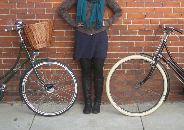 Here is a close-up of the wheels and head-tubes, with my body in between for a sense of scale. If you think there is not much difference between 26" wheels and 28" wheels, look again! The vintage Raleigh's wheels are monstrous compared to the Pashley's. Traditionally, both men's and ladies' English Roadsters, as well as Dutch bikes, were built with 28" wheels. However, lately a number of bicycle manufacturers - including Pashley, Velorbis and Retrovelo - have been fitting the ladies' models with 26" wheels, believing this to be a better proportioned choice. I am not sure whether I agree with them. What do you think?
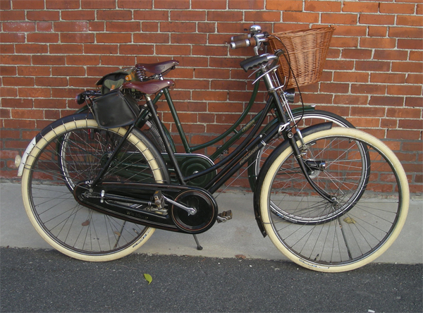 Additionally, there is more space between the saddle and the handlebars on the vintage Raleigh than on the Pashley. The difference is not quite as drastic as the angle of this photo makes it seem, but it is there.
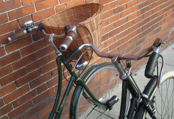 The stem and handlebars are not part of the frame itself, but differences between them should still be noted. The Pashley's stem is taller and has an additional upward-sloping extension (like the Nitto Dirt-drop/ Periscopa stem), to make the handlebars higher. The vintage Raleigh has a classic stem with a horizontal (flat) extension, which positions the handlebars slightly lower. The handlebars themselves are different as well: On the Pashley, the gripping areas are flared outward more than on the vintage Raleigh.
 As you may have noticed in the undertones of the past several posts, I prefer the vintage Raleigh's geometry to the modern Pashley's. Of course the Pashley has superior gearing and brakes, but the vintage Raleigh puts me in a more comfortable sitting position, and is faster and lighter than the Pashley. Yes, the 40-year-old clunker is faster and lighter - isn't that just bizarre? I can easily ride it for 30+ miles without being out of breath, whereas on the Pashley I often feel tired after much shorter trips. I am not certain which aspect of their anatomical differences accounts for this. It cannot be due to the 28" wheels alone: Batavus and Gazelle have 28" wheels and I find them to be slower and less comfortable than my Pashley.
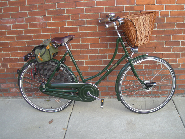 In an attempt to make my Pashley more anatomically similar to the Raleigh DL1, I have made some changes: The saddle has been raised and pushed back on the rails as far as it would go, and the handlebars have been tilted downward. I did not take a "before" shot, but on this photo from a few months ago you can see the difference.
 The Pashley does feel more comfortable this way, and my leg is almost entirely extended on the pedal now while still enabling me to touch the ground with the tip of my toe if need be. However, the Pashley is still as difficult to accelerate as it was prior to the changes. Hmm. If I had a magic framebuilding wand, I would build a bicycle that would replicate exactly - and I mean


